Hotel Bathroom Vanity Package Color Planning for Warm 2026 Bathrooms
Hotel Bathroom Vanity Package Color Planning for 2026 Projects
I once walked into a premium apartment mock-up where the vanity looked beautiful for about nine seconds. Then the contractor opened the top drawer, and the drawer front hit the P-trap cover because the sink had moved 38 mm from the cabinet drawing. The stone color was warm, the faucet was expensive, and the mirror light made the room feel like a small spa. None of that helped the drawer. Don't ask me how I know, but a bathroom that photographs well and works badly will make everyone angry.

That job is why I now treat a hotel bathroom vanity package as one decision, not five decorative choices. The surface, cabinet, sink, splash, lighting, and cleaning route have to sit together on the same page before anyone signs off. Here's what I'd do: build the color plan around daily use first, then make the room look good inside that limit.
The 2026 trend toward warm neutrals, softer stone tones, and wellness-led bathrooms is useful. I like it. A bathroom with stone, wood, off-white paint, and quiet lighting can feel better than a cold white box. However, warm does not mean vague. The moment you order 80 rooms, 160 sinks, and several cabinet batches, vague becomes a pain in the neck.
For the wider package logic, I keep linking this work back to Complete Guide to Bathroom Vanity Top and Cabinet Packages for Hotels and Residences. That core guide is the hub. This page is the color and finish branch, especially for rooms where the surface has to feel calm without looking muddy under bathroom light.
Why A Hotel Bathroom Vanity Package Needs One Color Standard
Warm bathroom palettes look easy because the samples sit nicely together on a table. Then the actual room adds steam, mirror reflection, towel color, brass finish, floor tile, and housekeeping chemicals. I have seen a soft beige top turn yellow under a 2700K vanity light. I have also seen a wood cabinet go orange next to a cream stone that looked clean in the office.
This is where you don't cheap out. Make one approved color standard for the complete package, and photograph it under the same light temperature planned for the room. If the hotel uses 3000K at the mirror and 4000K near the shower, test both. A small shift can change the way Grey Sintered Stone Vanity Tops read beside wood veneer.
I do not ask teams to chase a perfect match. That usually makes the room stiff. I ask them to define acceptable difference. The top can be half a tone warmer than the wall tile. The cabinet can carry more grain than the floor. The sink must still look intentional when toothpaste, water drops, and face cleanser sit around it at 7:10 in the morning.
Start With The Light, Not The Slab
A warm stone sample under warehouse light tells only half the truth. In a real hotel bathroom, the mirror light bounces off the basin, the splash, and sometimes a polished faucet. A top that looks soft under ceiling light can turn flat once the mirror casts a hard stripe across the back edge.
Here's what I'd do. Put the top sample, cabinet finish, sink sample, faucet finish, and backsplash sample in a shallow tray. Add a white towel and a warm gray towel. Then check the tray under 3000K and 4000K light. Don't ask me how I know, but a towel can make the undertone argument much clearer than another email thread.
If the room already has a fixed wall tile, use that as the anchor. If the cabinet finish is already purchased, treat the cabinet as the anchor. A white quartz option such as Pure White Quartz Bathroom Countertops can be selected around those fixed pieces, but the wrong cabinet tone can make even a good surface look tired.
Hotel Bathroom Vanity Package Checkpoints Before Production
I like a simple approval table because nobody remembers six separate meeting notes when production starts. The table below is not decoration. It is the short list I want signed before the factory cuts the tops or drills the sinks.
| Checkpoint | What I Ask The Team To Confirm | Why It Matters On Site |
|---|---|---|
| Mirror light temperature | Test stone and cabinet under planned 3000K or 4000K fixtures. | Warm tops can shift yellow; cool whites can turn gray. |
| Cabinet opening clearance | Check drawer movement against sink bowl, waste pipe, and faucet hose. | A beautiful front is useless if the drawer hits plumbing. |
| Backsplash height | Confirm 80 mm, 100 mm, or full-height splash before top cutting. | Water behind a low splash becomes a maintenance complaint later. |
| Edge profile | Match edge radius to guest safety, cleaning, and cabinet reveal. | Sharp edges chip faster and feel harsh in small bathrooms. |
| Sink cutout tolerance | Compare template against final sink model, not a catalog drawing. | A 5 mm mismatch around an undermount sink looks sloppy forever. |
The Hard-Won Lesson: Approve The Package Under The Real Mirror Light
On one serviced-apartment job, the approved board used a warm taupe cabinet and a cream top. It looked clean in the meeting room. The site used 4000K mirror strips because the operator wanted brighter grooming light, and the same cream top turned slightly green beside the cabinet. The developer had 62 vanities already boxed when the mock-up complaint came in. We did not replace everything, thank goodness, but we lost nine days changing the mirror light and rechecking the sample room.
The Lesson: Never approve a warm vanity palette under a light that will not exist in the finished bathroom.
How I Match A Warm Stone Vanity Top With Cabinets
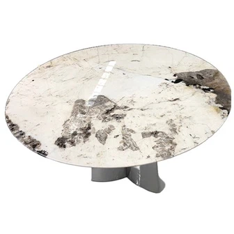
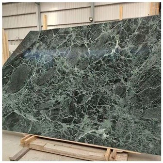
A warm stone vanity top works best when the cabinet has a clear undertone. Oak, walnut, greige lacquer, and warm white can all work. The trouble starts when the cabinet is almost warm but slightly pink, or almost gray but slightly green. That in-between finish makes the stone look guilty even when the stone is not the problem.
I ask for a cabinet door at full size whenever possible. A 100 mm finish chip hides too much. Grain direction, sheen, and edge banding all show up differently when a door sits vertically. Then I place the stone sample flat, because that is how the top lives. It sounds simple because it is simple. People skip it anyway.
When the project needs durability more than natural variation, Single Sink Sintered Stone Vanity Countertop planning can keep the color plan steady across many rooms. I still want a mock-up. Printed movement can repeat in a way that bothers the eye when every room has the same layout and the same mirror reflection.

Where Quartz Still Makes Sense
A quartz bathroom vanity top is still a practical choice for many hotel and residential jobs. It can give controlled color, easier room-to-room consistency, and a surface that does not ask housekeeping to become stone experts. I like it especially when the cabinet color already carries the personality.
But controlled color does not excuse lazy detailing. The faucet hole still needs reach. The basin still needs enough deck space for daily use. The front edge still has to feel comfortable when a guest leans on it half awake. If the top is quiet, the details become louder.
For mistake prevention, I keep Stone Vanity Top Mistakes to Avoid in Project close to this topic. That support guide covers the practical traps that appear after the color board has already won the meeting.
Cabinet Finish, Sink Shape, And Splash Height Have To Speak Together
A bathroom cabinet finish is not just color. It changes how deep the vanity feels. Dark walnut can make a 520 mm-deep cabinet look heavier. A pale greige finish can make the same cabinet feel lighter, but it may also expose every gap against a darker floor.
Sink shape also changes the color reading. A square white ceramic sink can make a cream top look warmer. A soft oval basin can calm the contrast. If the faucet is brushed brass, the whole scene leans warmer again. This is where you don't cheap out on the mock-up photo set.
For hotel work, I also check splash height with housekeeping in mind. A 50 mm splash may look refined in a rendering, but water behind the vanity is not refined. If the wall is not perfectly flat, a low splash can leave a shadow gap that annoys the installer and the owner. Small thing. Big annoyance.
The support article Hotel Bathroom Cabinet and Vanity Top Packages is useful here because the cabinet and top rarely fail alone. They usually fail as a pair because one team approved the top and another team approved the box below it.
Understanding Warm Bathroom Vanity Packages in Today's Market
Why Warm Palettes Are Getting Attention
Warm palettes answer a real problem. Many hotels, apartments, and villas spent years using cold whites and gray surfaces. The rooms looked clean, but some felt flat. Current design conversations are moving toward soft stone, warm neutrals, and quieter material contrast. I can work with that direction, as long as the details stay honest.
The hotel bathroom vanity package has to carry both mood and maintenance. A room that feels restful at night still needs bright grooming light in the morning. A top that looks gentle still needs to handle splashed water and daily cleaning. A cabinet that feels warm still needs enough clearance for drawers, traps, and wall variation.
What To Do When A Problem Shows Up On Site
If the installed mock-up looks wrong, do three things before anyone keeps installing. First, document the issue with wide photos and close photos under the actual bathroom light. Second, stop installation in similar rooms until the issue is checked. Third, send the supplier the original approved samples, drawings, and inspection photos for comparison. I know people want to keep moving, but installing the same mistake faster never saves the job.
I also connect this topic back to Complete Guide to Bathroom Vanity Top and Cabinet Packages for Hotels and Residences because color planning is only one part of the package. The better habit is to approve the whole bathroom working set before production, not chase problems after delivery.
FAQ
1. What is the safest way to approve a hotel bathroom vanity package color plan?
The safest way is to approve the stone, cabinet finish, sink, faucet finish, backsplash piece, towel color, and mirror light together. Do not rely on separate samples from separate meetings. I like one physical approval board and one mock-up photo set under the actual light temperature. If the room uses both task light and ambient light, check both before production.
2. Can a warm stone vanity top work with white bathroom cabinets?
Yes, but the white cabinet cannot be a cold blue-white unless the stone also reads clean and cool. Warm white, ivory, greige, and soft taupe finishes usually work better with a warm stone vanity top. I still ask for a full-size cabinet door because small chips hide undertone problems. Don't ask me how I know, but a cabinet edge band can betray the whole palette.
3. Is quartz or sintered stone better for hotel bathroom vanity projects?
Both can work. Quartz often gives calm color control and a familiar fabrication route. Sintered stone can help when the project needs thin profiles, heat resistance near styling tools, or a more porcelain-like surface behavior. The better answer depends on the sink type, edge detail, room count, cabinet finish, and cleaning routine. Material choice alone does not solve package coordination.
4. How many mock-up checks do I need before production?
For a small project, I want at least one complete mock-up with the real cabinet, top, sink, faucet, and light. For a hotel or multi-unit residence, I prefer one signed mock-up plus one pre-production sample set from the actual batch. If the vanity is wall-hung, add a support and plumbing check before cutting all tops.
5. What should I do first if the installed vanity color looks wrong?
Take wide room photos, close photos at the top-cabinet joint, and one photo with the light temperature noted. Do not keep installing the same package until the issue is reviewed. Then send the supplier the approved sample photos, cabinet finish record, lighting specification, and mock-up notes so the difference can be compared without guesswork.
Quick-Reference Checklist for Vanity Package Color Approval
- Test the stone and cabinet together under the actual mirror light temperature.
- Check sink cutout drawings against the final sink model before production.
- Open every drawer in the mock-up after the plumbing route is shown.
- Confirm backsplash height against cleaning needs and wall flatness.
- Photograph the approved package with towels, faucet finish, and cabinet door included.
- Freeze the color standard before ordering multiple cabinet or stone batches.
Final Conclusion
A warm bathroom palette is not hard because warm colors are difficult. It is hard because the top, cabinet, sink, faucet, splash, and light all change one another. If you approve them separately, the room may pass the sample meeting and fail the morning routine.
My practical rule is simple. Build the approval around the way the vanity gets used: drawers opening, water splashing, towels sitting on the deck, mirror light hitting the front edge, and housekeeping wiping the sink at the end of the day. When those scenes work, the design has a real chance. Here's what I'd do: slow down the mock-up, check the package under real light, and remember that this is where you don't cheap out, because I would rather fix one sample room than explain 80 avoidable bathroom problems to a KA UNITED project team.

References
NKBA Bathroom Planning Guidelines, National Kitchen and Bath Association.
France to Florida: European Design Trends for 2026, National Kitchen and Bath Association.
Designing for Wellness: Kitchen and Bath Concepts That Support Self-Care, National Kitchen and Bath Association.
5 Timeless Bathroom Colors You'll Still Love in a Decade, Livingetc.
Bathroom Design Trends for 2026, Pacific Shore Stones.
Tile Council of North America Handbook for Ceramic, Glass, and Stone Tile Installation, Tile Council of North America.
Google Search Central Editorial Notes, Google Search Central.